Making "Хочу в ТГУ" app with Flutter. Part 1 - Application design
Prologue
This series (yes, it will be a series) is taken from the paper I have written in the university. It is a report on the process of building “Хочу в ТГУ” application.
In case you want to have a look at the application… all of a sudden it is only available in the Russian language now. If this doesn’t scare you, you may find an iOS version here and Android version here.
I decided to publish the text, first of all, since my paper was highly scored by four academics who had read it. I would also like to thank my supervisor Lidia Ivanova who has pushed me to make it much better than I would make it myself 😃.
I also have modified text a bit. Mostly changed dry and dull formal writing to something more alive.
The app
Tomsk State University (I will mostly use “TSU” abbreviation here) has a special website with many important and helpful information for enrollees. With information about the application process, available programs and so forth.
And it’s also had a native application, but it did not support updated API, which caused many usability problems.
And, as I had an internship at university (where we had to work on real-world projects😃), I have been given the task to develop a new application😃.
Taking into account the fact that the application will be distributed to the Android and iOS marketplaces, the goal was to develop a cross-platform application.
To achieve this goal, the following things were done:
- Research of the existing solutions.
- Application design.
- Implementation.
I will drop section with the research of the existing solutions out as it doesn’t bring any important information.
About
This article is intended to show the formal application design (a.k.a analysis) that is done to clarify:
- What functionality application should realize
- How the application should be created
- What tools should be used to create it
- It’s discussed how to architecture the application
- Declared what views it will have
- Entities that will be used and their relations are declared too
Requirements
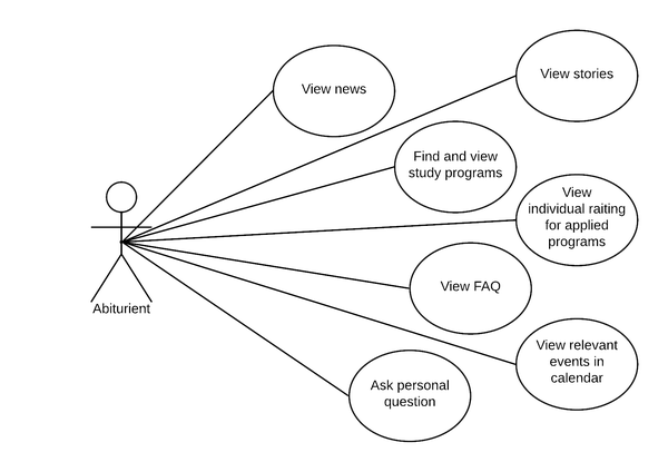
After reviewing existing applications and receiving requirements for this application from the university stuff, functional and non-functional requirements were formed. This is a functionality that a complete application should provide to the user.
Functional requirements:
To show the functional requirements, UML Use-Cases diagram was drawn:
Non-Functional requirements:
- The app should use the REST API to retrieve app data from servers.
- The app should cache opened news.
- The app should save data about government exams, so the user does not have to enter it twice.
- The app should run on Android and iOS mobile operating systems.
Problem Domain Model
To represent the business domain(what is that), corresponding diagram was made:
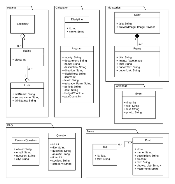
Here
Questionentity represents fixed question-answers loaded from the server and shown to the user on the screen, whilePresonalQuestionrepresents an entity that is filled by the user-provided data(through the in-app form) that is sent to the server later on.Used technologies and tools
Considering that the app should run on both Android and iOS operating systems, cross-platform development framework was in favourable choice to native development.
After reviewing two front-edge solutions, React Native and Flutter, the Flutter framework was chosen for the development. Let us go through different cases and see why.
- Flutter is an open-sourced SDK created and supported by Google and was initially released in May 2017. Flutter is using the Dart language, which is also developed and supported by Google. Meanwhile, React Native was developed by Facebook and initially launched in 2015. In React Native JavaScript is used as the primary development language.
- Dart in Flutter features ahead-of-time compilation for Flutter application run in release mode which results in self-contained and native executable code running on iOS and Android. JavaScript features just-in-time compilation and which is translated by React Native framework to native elements through Bridges on the app run. Given that the Flutter code translates into machine code and run directly on the phone it usually provides better performance than React Native that needs to translate JavaScript to native platform elements that would be translated to machine code.
- All UI in Flutter application is constructed using Widgets – components in the form of classes that describe what their view should look like given their current configuration and state. In React Native UI constructed using HTML like components and styled with CSS. In my view, the Flutter approach to constructing the application is more closer to experience seen in native Android and iOS development. While React Native take major from React – the web development framework, those it will better suit developers with web development background.
- In debug mode Flutter also features a just-in-time compilation, like React Native, that is used by “Hot Reload” feature. It makes it possible to update the application and rebuild a widget tree without completely reloading the application and losing current states of the widgets.
- Additionally, Flutter provides better development and profiling tooling.
Development tools
Regarding main development, everything happened in Visual Studio Code editor from Microsoft. It allows to develop applications for Flutter and have a fast and minimalistic interface.
Additionally, Android Studio IDE from Google and Xcode IDE from Apple were used for working on platform-specific areas like creating and running Android Emulators and iOS Simulators, for setting applications ids, names, icons, splash screens.
Flutter plugins
In the application additional open-source libraries were also used to cover development needs:
- bloc – state management library used for building the architecture of the application. This package will be discussed in more details in the Architecture section and in the next article on implementation, which is coming soon.
- retrofit – dio client generator used for automatic methods generation that realizes calls to server API and converts JSON received in response to Dart classes.
- hive – NoSQL Database used for storing news and selected subjects. This DB will be discussed in more details in the Data Storage section.
- flutter_screenutil – library for adapting sizes and fonts to different screen sizes. With this library, UI elements sizes and text fonts get correctly adjusted for all possible screen sizes, which are not always achievable using build-in logical pixel sizes.
- get_it – Service Locator library used for accessing database instance from application BLoCs.
- flushbar – library for making customizable and variative notifications in the application.
- table_calendar - library for displaying events on the months’ calendar.
Architecture
Flutter framework does not have build-in architecture system, nor it provides one best-practice solution or approach. Developers should choose architecture solution by themselves from quite a significant amount of approaches that could differ a lot.
Before choosing final architecture, three approaches have been reviewed, namely: Vanilla, BLoC and MobX. Here is a short overview:
-
The vanilla approach represents an application where everything happens in application widgets. All logic, data operations, manipulations, UI encapsulated together. This approach is fast and easy to implement and follow for small applications with very low or no business logic. However, for more significant applications with different business processes, this results in huge classes that are hardly maintainable, updateable and testable.
-
BLoC approach put much more structure into the application compared to the vanilla approach. It separates an application into three layers: presentation, business logic, data (this is also discussed in more details next section). Each layer is picked out by the responsibility area and limited to what it should do in a concrete area(UI, business logic…).
Also, BLoC makes the use of Dart build-in reactive programming solutions, which helps to build a fast and reactive app with relatively easy implementation. An example: widgets subscribe to state stream of the BLoC and UI updates automatically as soon as the new state with data is available(which is loaded from the server, for example).
Thanks to the separation of responsibilities, it is easier to test and change different parts of the application.
-
MobX – this package and approach resemble BLoC in a reactive programming approach in connection UI and data. However, it puts a bit less structure on responsibilities separation and specializes mostly on reactive data delivery. Though, MobX also present separation of business logic and data operations from UI, but lack the level of testability of BLoC.
After the analysis, the BLoC approach has been chosen for the architecture. It’s one that suite well for the app that fetches a lot of data from the servers and wraps most of its logic around it.
Package Diagram
To represent the architecture and show “layering” in the application UML package diagram was drawn:
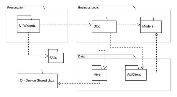
Each package in the layer poses behaviour peculiar to only this layer.
As can be seen, there are three main layers:
-
Presentation – this layer contains everything that would be shown on the screen to the user:
- UI Widgets – widgets that show the user a GUI, present him data loaded from the server. They do not perform any operations on data and only show what they have received from the Business Logic layer. Or collect data and pass it to the Business Logic layer.
-
Business Logic – this layer contains the business logic of the application. Elements in this layer are responsible for the correct work and behaviour of the application. Here are the packages that are responsible for that:
- BLoC – classes that contain all the logic of the application. These classes organize data loading from/to server, saving/loading to/from a database. All the manipulation with the data mostly encapsulated here. It also provides data to the Presentation layer.
- Models – are classes that represent the problem domain and used for transferring the data between layers.
-
Data – this layer represents all objects that provide data to other parts of the application:
- Hive – DB that is responsible for data saving on the device.
- ApiClient – package that organizes data loading from/to the server using Http protocol.
There are also additional packages that do not fit into the above layers:
- Utils – package that contains additional supporting classes. For example, for a time conversion to special String format.
- On-Device Stored Data represent raw byte data stored on the user device by Hive DB.
State Diagram
For showing application screens and navigation between them, several UML State diagrams were drawn:
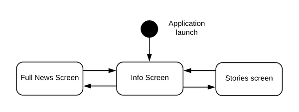
The state diagram for info screen After launching the application Info Screen (above picture) opens. Here user can read news and open them in more detail or view stories.
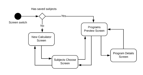
State diagram for calculator If the user wants to use a calculator to search for different courses, he opens the corresponding screen (above) using the bottom navigation bar. On the screen open corresponding BLoC check if there are saved subjects for the calculator. If subjects persist in DB, they are loaded, and Program Preview screen opens automatically. If no, the user sees a welcome screen that asks to select subjects for the calculator on Subjects Choose screen, after that Program Preview screen opens.
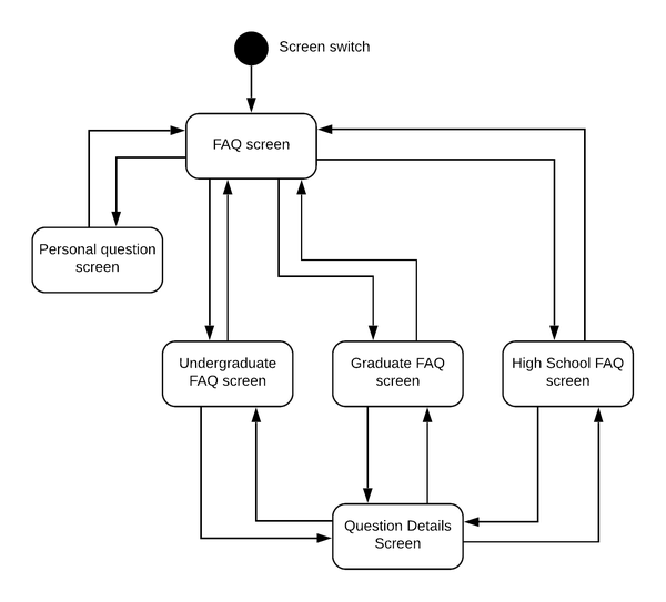
State diagram for FAQ screen For getting answers for different questions, the user can open FAQ screen (above) using the bottom navigation bar and browse some ready-made answers and questions. For example, read Undergraduate Frequently Asked Questions. If the user has a question that is not covered there, he can ask his personal question on Personal Question screen.
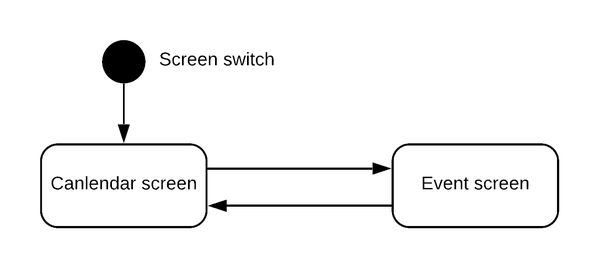
State diagram for calendar screen To find out upcoming events, the user can open the Calendar screen using the bottom navigation bar and browse the monthly calendar with events. If the user wants to read more details about the event, he can view them on the Event screen.
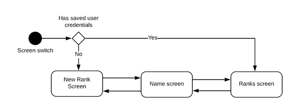
State diagram for ranks screen If the user wants to see his rank for enrolled courses, he opens the corresponding screen (above) using the bottom navigation bar. On the screen open corresponding BLoC check if there are saved user credentials. If user data persist in DB, they are loaded, and user rank is opened on Ranks screen. If no, the user sees a welcome screen that asks him to fill his full name on Name screen. After that screen with ranks opens.
Also, the user can close and exit application being on the first screen of the type.
Data Storage
As there is a need to cache some data loaded from the server application needed a database. Since the primary usage of the database is lying on news saving and loading them on every app launch, speed was an essential factor. With this regard in mind and the fact that data that would be stored has little or no relations (diagram below), Hive DB was chosen. It is a NoSQL key-value database that works incredibly fast compared to SQLite, the classic mobile relational database. Additionally, it is much faster in implementation compared to SQLite since it has needed queries build-in and require less management and provisioning.
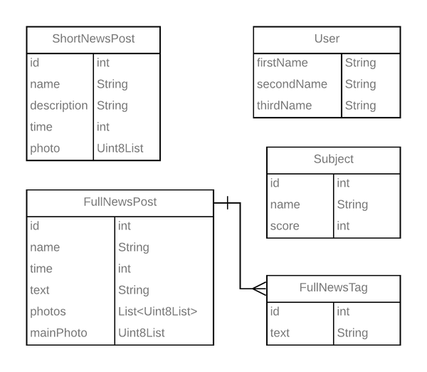
Entity relationship diagram of the database Wrap Up
These are what have been done to ensure a fluid start of application implementation in code.
Next article on how it all was implemented is running in process… stay tuned😉.
- Don't think you will look foolish in your friends' eyes, check how your share post will look like👇
By the way, you always can change the share text.
 Great Guy (or Girl😊)August 31Here you will have to type something yourself🤷♂️. Thanks to Facebook :)
 NIKITAGONCHARUK.COMMaking "Хочу в ТГУ" app with Flutter. Part 1 - Application designReport on building "Хочу в ТГУ" app using Flutter framework. In this part application design is discussed: what to implement, what tools to use, and more.
 Great Guy (or Girl😊)·Aug 31Interesting article on creating app with #Flutter. Writer covered the application technical design with thoughts on architecture of the application and other parts. And there are also UML diagrams ... 😮
 Making "Хочу в ТГУ" app with Flutter. Part 1 - Application designReport on building "Хочу в ТГУ" app using Flutter framework. In this part application design is discussed: what to implement, what tools to use, and more.nikitagoncharuk.comMaking app with Flutter - Application design
 Great Guy (or Girl😊)To: meHey! Check an interesting article I found on creating app with Flutter!
Here is the link: https://nikitagoncharuk.com/blog/making-хочу-в-тгу-app-with-flutter-part-1-application-designBy the way, you always can change the share text.
- Date published: November 8, 2020