Making post categories with emoji
I was thinking long about how to create categories for the blog posts and not to overwhelm the site. I by heart wanted to keep my site as simple as possible. Only text and some pics when needed and without fancy design.
I really liked how Jonnie Hallman did that in his blog with minimalistic and slick looking categories. But I didn't want completely copy what he did. And after a few days of thinking how I can build something myself, I remembered about Justin Jackson blog with excellent articles for bootstrapers (highly recommend to read them), where he marked the hottest ones with the 🔥 emoji. And everything got set in my mind. I would choose a pack of different emojis and use them to make post categories. So every post would get an emoji explaining the general idea behind it. And since emojis can be understood in very different ways (well, It depends on context, I know), I have decided to show category description in tooltip on emoji hover. So the reader could always find what particular post would talk about. Decided, done.
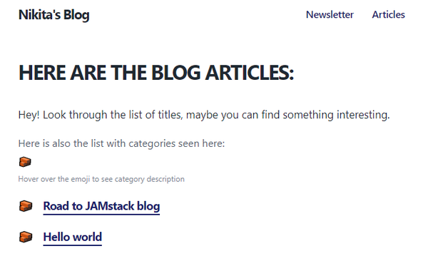
To show all the blog categories existing right now, I have made a horizontal list with the emojis and also added some explanation texts, so the reader could understand what a is this for. I also planned to use these list with emojis to make the ability to sort the posts by category (Jonnie, if you read that - sorry, I really copied that from you). So you can click on the emoji from the list and blog posts gets filtered by this category.
However, looking at the final result the next day with a bunch of text lines, I understood that it looks filthy. Just look at it:

But I had no idea how to make all that neat 😐. I have played a bit with removing page title/description/categories list description, but it all still looked bad.
After some time I decided that it does the job, so I left it like this for now. Would definitely work on this in the future.
- Don't think you will look foolish in your friends' eyes, check how your share post will look like👇
By the way, you always can change the share text.
 Great Guy (or Girl😊)August 31Here you will have to type something yourself🤷♂️. Thanks to Facebook :)
 NIKITAGONCHARUK.COMMaking post categories with emojiHow I have decided to categorise posts in the blog by emoji
 Great Guy (or Girl😊)·Aug 31A fun way to categorize posts in the blog:
 Making post categories with emojiHow I have decided to categorise posts in the blog by emojinikitagoncharuk.comA fun way to categorize posts in the blog
 Great Guy (or Girl😊)To: meHey! Check an interesting article I found!
Here is the link: https://nikitagoncharuk.com/blog/making-categories-with-emojiBy the way, you always can change the share text.
- Date published: August 1, 2020