Creating main page and icon
Finished with the blog related part of my website, I also needed to create an index page, which everyone coming to my website will see. I was thinking long about how to make it. Making the portfolio like main page would take time, and first I doubted if I need it. In my view, portfolio pages mainly targeted at people who would want to hire you, whether you are a freelancer or an employee, which I didn’t see in myself. I always wanted to take a road of self-sufficing and earning money from created products, rather than directly exchanging time to money. At some time, I thought about just listing the blog articles on the main page, since the main point of this website is to share my thought and what I’m learning and doing in the world. But then I thought about a thing such as a credibility.
I’m just starting out, and no one knows me, so when they land on my site and see only titles and texts, they have no idea if my writing worth their time. So how I would convey to people that I’m worth listening to? You may still say that through the words, by adding a cool headline, for example. And that 100% right. But here is one point. Even if they caught by the headline, they would need to dive into my article, absorb what I write, to understand if I’m worth their time. And that takes time. And I doubt many will do this. On the other side, visual “signs” are much faster deliverers in that regard. When a person opens a blog page and sees some good, interesting work, the creditability of the author increases. And I had something to show. That’s definitely not as great as mentioning that I worked at Google (well, Google has dark and light sides), or Basecamp, or created a multimillion company. But projects I have worked on are quite worth sharing, as I think. So yeah, in the end, I have decided to make a portfolio like main page.
Creating mobile apps showcases
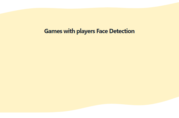
Being mostly a mobile developer, my best projects are around that. And my first thought was to embed phones mock-ups with video of the working apps. That looked like a great idea. But after doing research on how to do it, I understood one thing: I could not find mock-up for the smartphone I have to show my games at work. I needed a physical phone to show games, yeah. Sadly, I had to put video-based showcases aside. Another way was creating simple picture mock-ups. That’s way easier. I already had screenshots for iPhone 11 and finding free mock-up was no brainer. After checking four different versions, I have stopped on this iPhone 11 Pro mock-up for Figma.
Doing the same with Android took much more time. Since I could not find mock-ups for my smartphone, I had to use an emulator to create screenshots for my games: Eyes On Me and Blink Killer. But in Android Studio the most modern-looking predefined emulator available is Pixel 3 XL which already looks a bit old. But I wanted to have something up to date. And even for it, I could not find free, suitable quality mock-ups for Figma. That’s the sad point about Android. Being so vast in phones and due to big differences of resources available for each, it could be tough to do such tasks. But I anyway needed an Android phone, since the games are present only for them. And I have decided that I would go with Google phone anyway. So to speak, as a tribute to the creators of the operating system 😃. Choosing Pixel 4, which is the newest Google phone, was an expected choice. Since there is no preprogrammed Pixel 4 emulator (no idea why) in Android Studio, I had to create a custom one. Luckily, with available specifications, I fastly created one and made needed screenshots. Finding Pixel 4 mock-up didn’t take hours, as I have found this perfect one. Some time in Figma and app’s images was ready.
Working on the page look and structure
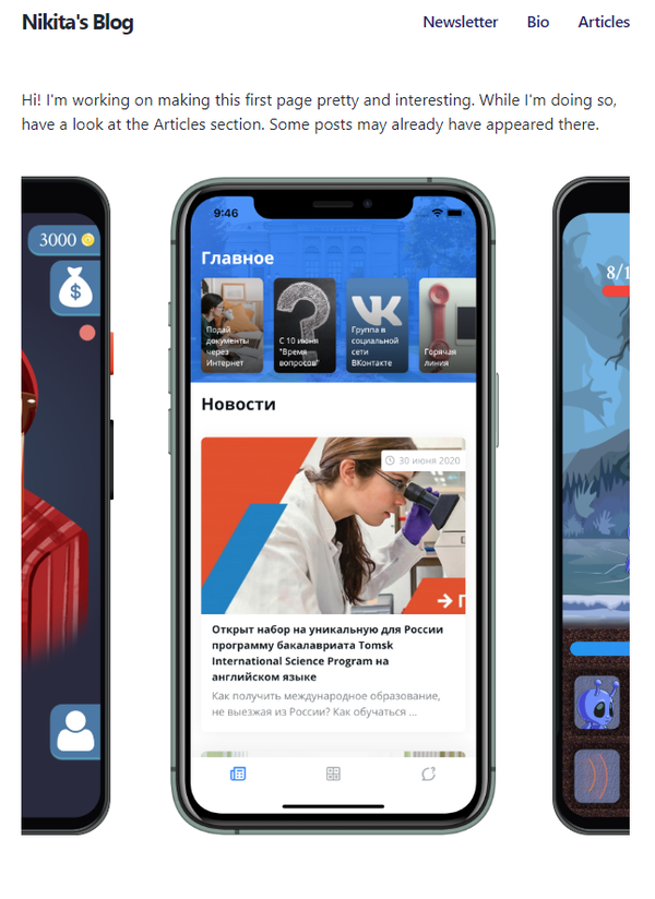
After creating mock-ups, I arranged them in the way I planned:
But looking at the result, I understood that they look too … formal. Sadly, didn’t take a screenshot of how it was to show you. Anyway, I liked the details of the Pixel 4, the orange power button ... and I wanted to keep them … but mock-ups didn’t really fit well together.
Next idea that came into my mind is to create a carousel with the phones and text under each one. The possible result looked promising in my mind, and I fastly created example look. The result was not bad:
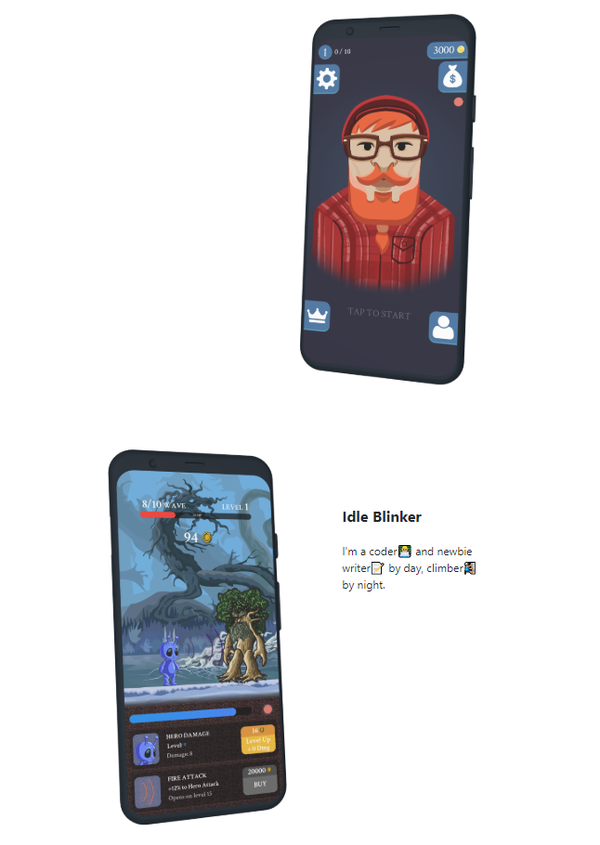
Making all that carousel to work and look well looked not the easiest task, but entirely possible, so I started looking for solutions. During that time, I remembered about one mock-ups plugin in Figma, and I also checked it out. It allows creating 3D mock-ups of iPhone 11 and Pixel 4 and rotating them in any axis. With no dought, I also created 3 new images with a bit rotated phones, loaded that on the page, and the result was even better than with carousel. This 3D images for my game apps made precisely what was needed – page started to look less formal, and the overall feeling was much better:
Next, I wanted to create a visual section for the games with fresh and fancy waves as top and bottom borders. I saw that on many great looking sites and wanted to have that too. After googling the theme, I have found great tool – Get Waves, that allows to generate customizable waves and easily embed them into the website with HTML. It’s easy as this:
<svg>
  This should be an top SVG wave taken form getwaves.io site
  <path
    fill="#fff3c4"
    ...
  />
</svg>
<div style="color: #fff3c4;">
  This is your section body
</div>
<svg>
  This should be an bottom SVG wave taken form getwaves.io site
  <path
    fill="#fff3c4"
    ...
  />
</svg>
And the final look:
Last part was writing and adding supplementary texts which took some time, but nothing fancy to tell about.
Creating an icon
When I found Get Waves site, I really liked its design. It was simple, clean, vibrant - great, to say shortly. And while checking the site, I also discovered Blob Maker, from the same studio. I played a bit with it and closed it.
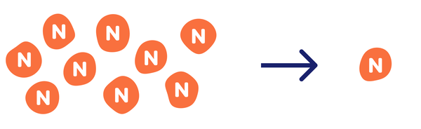
After some time, while working on the main page, I got an idea about how I could create a cool icon for my site. Before I had the simple text “Nikita’s Blog” as an on-page icon and letter N as a favicon for the tabs. That did the job, but it still wasn’t looking great. So I thought: why not to generate a blob and put N letter in the centre of it? Simple but creative. I have made a bunch of blobs, and after comparing them all, chose one:
Added it to existing text, played a bit with text colour and sizes and got the final result:

Here is the old look for comparison:

Blobbing the site
After I made the icon, the idea of using blobs on the site has taken my mind.
I have changed my picture in Bio into the blobby form:

In the beginning, the first paragraph on the main page was a simple text where I have explained who I am and what I’m doing. Looking at it, I had conflicting feelings. It delivered the message I wanted to say but seemed a bit copied at the same time. And I wanted to change it, but all the approaches were no better. After some time, I got a thought that blob could also save me here. I generated one in indigo colour and added a lovely orange welcome message over it with some complementary text on the side:
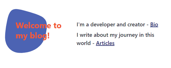
This way it looks much cleaner, and although I use 90% less text, it says all that I wanted to say. Not bad.
P.S. While taking a screenshot for the previous point, I understood that I have a huge visual difference between right and left parts of my index page. On the left, I have a blog icon, blob with the welcome message and iPhone picture, while on the right, there are only visually light text. My first thought was: “Omg, I need to change the half of the page...”, but then I remembered about a project I’m planning to start and understood that the section for it would balance everything. “Good...”
So, stay tuned 😉
- Don't think you will look foolish in your friends' eyes, check how your share post will look like👇
By the way, you always can change the share text.
 Great Guy (or Girl😊)August 31Here you will have to type something yourself🤷♂️. Thanks to Facebook :)
 NIKITAGONCHARUK.COMCreating main page and iconHow I have decided what to include on the main page and how I created it. How I made the site icon with blob and how blobs eventually captured my site.Great Guy (or Girl😊)·Aug 31Interesting article on creating personal projects showcase page and some reasoning behind that: Creating main page and iconHow I have decided what to include on the main page and how I created it. How I made the site icon with blob and how blobs eventually captured my site.nikitagoncharuk.comBuilding personal showcase page and some reasoning behind itGreat Guy (or Girl😊)To: meHey! Check an interesting article I found!
Here is the link: https://nikitagoncharuk.com/blog/creating-main-page-and-iconBy the way, you always can change the share text.
- Date published: August 6, 2020